Common Style Inventory

The idea here is to collect a lot of standards layouts in this area so they can be referenced for all portal projects. More styles will be added as we find they are needed. This page is best used by viewing its source code to see how each of the examples is built. In all these examples, the <blockquote> tag is merely for offsetting the code and not intended to be included in the examples themselves.

Testing

HTML5 Validation

All content should be displayed using valid HTML5 markup. Validate the code your application creates by using the W3C Markup Validation Service. Copy the source code from your page and use the "Validate by Direct Input" option in the validator site. (This bypasses the problems with scanning applications that live behind the portal login.) Alternatively, you can save a copy of your HTML5 output to another webserver and validate it using the default method.

Even after your code has been completely validated, the W3C Validator service continues to give the warning "Using experimental feature: HTML5 Conformance Checker." It basically means their service is still in development.

Accessibility

Once a page has been validated for HTML5 compliance, it should then be tested for accessibility using the Web Accessibility Evaluation Tool. This service requires that a copy of your output HTML be hosted on a webserver outside the portal for testing. Our targets are 0 errors and minimal alerts. Errors are obvious problems, but alerts can sometimes be false alarms. Rules for accessible code are often ambiguous and difficult to scan for automatically. When in doubt, go ahead and fix the alerts, too.

Sometimes an element that is required for accessibility is not necessary to be displayed. Instead of omitting it, you can move these elements off of the screen by using class="offscreen" as an attribute. This removes the element from view, but still keeps it in the page's flow for screen readers.

Browser Identification

Sometimes your code will not function the same way on one browser that it does on others. If want to alert people who are using the faulty browser that they may need to use a different one, you'll need to identify which browser they are using.

You are using .

Tools

screenshot for alt-command-m in firefox
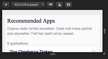
Firefox: Alt + Command + m

This handy key combination converts the Firefox content panel into a resizable area with height and width dimensions, customizable presets, and even a built-in screenshot maker. This is great for testing a page's responsiveness across different screen sizes.

Regular Text

Text not associated with any other elements should usually be in <p> tags. Use paragraphs to separate paragraphs of text rather than tossing in <br>s everywhere.

This paragraph uses class='generated' to make the text smaller and italic. This is the style we use for statements like "This report was generated at 12:34:56 p.m. on July 17, 2014."

Details / Summary

One of the new HTML5 tags is <details> which, along with its partner <summary>, allows you to create a simple expandable section without the need for additional javascript:

The rest of the content is available when a user clicks the summary.

Form Elements

Buttons

Buttons that only interact with the current page (via Javascript, etc.) should be gray. Buttons that submit form data or commit updates are dark blue.

Sometimes a submit button is needed even though it is not the expected forward course of action. In these cases use class="notmainsubmit" to make it gray.

And sometimes you might want a control for a form that isn't a button, but it needs to look like one. For this, use div class="fakebutton".

Search
  Link as a Submit Button

We are deprecating Ladda buttons. Another style of button is called "Ladda." See examples of Ladda buttons here.

Tables

(Because of troubles with layout responsiveness, we are promoting Data Tables instead of Tablesaw.)

Table data is the only kind of content that should be laid out in a table. It is good to note that many input forms are suited for tabular data. The <th> tags should contain the <label> for the input field, and the <td> tags will contain the fields themselves. Use class="simpleform" to style regular tables.

Use class="showcase" for tables that need to be wider.

Don't be afraid to limit the width of your label columns if they look too far from the inputs. You can assign a local class="mytable" (or something) and define the width in your <style> section.

Use class="right-align" to align the left column's labels to the right for displays wider than mobile.

Text Inputs

Needed when users must type a single line of text.

Unmasked Password

Because it is rare that someone else might view a person entering a password, and because masked passwords make it more difficult to know if you've entered it correctly, current UX studies suggest un-masking password fields. The user is given the option to conceal the password, but the field is offered as plain text initially.

Show Password

This technique requires the following javascript which handles accessibility issues as well. The CSS is baked into application.css already.

$(document).ready(function () {
    $('#showpw').click(function() {
        var mybutton = $('#showpw');
        if(mybutton.attr("aria-checked") === "true") {
			mybutton.attr("aria-checked","false");
			$('#pw1').attr("type","password");
		} else {
			mybutton.attr("aria-checked","true");
			$('#pw1').attr("type","text");
		}
	})
});
			 

Number Stepper

While HTML5 has an input for type="number" with a tiny stepper on it for making incremental values, a better version would have larger targets for the stepper. So I've built into the new styles a layout for these:

You'll need to include a call to jQuery and um_stepper.js at the bottom of your pages to make this work. Here's the code above: <input type="text" pattern="[0-9]+" class="stepper" name="mystepper" id="mystepper" value="3">. The "stepper" class identifies that input to the javascript, which then builds the buttons. The pattern attribute should invoke just the number keyboard for mobile devices.

Pickadate and Pickatime

We have new options for choosing dates and times that are responsive. See the Pickadate example.

Fieldsets

Option elements like radio buttons and checkboxes lose their meanings without labels and other associated context. To gather related elements under a single question, it is helpful to group them within a <fieldset> element.

All fieldsets must have an accompanying <legend> that serves as the explanation for the grouping. "Choose an option" or "Which of these do you prefer?" are examples of legends. When a legend is required for accessibility but is not desired, the class="offscreen" attribute can be used. The following examples of radio buttons and checkboxes use fieldsets.

Note that option elements shown here are using class="nice" to style them nicely. Until a better solution can be found, the structure to support this styling is two-fold. The "nice" class must be on the surrounding element for each of the option elements (usually a span) as well as on the element that groups them (usually the fieldset).

Radio Buttons

When the user must choose only one option from a group. In the case of radio buttons, it is often helpful for one of the options to be preselected using the checked attribute. There should always be at least two radio buttons in a set to give the option of one not being selected.

Answer yes or no.

We encourage all option elements to be grouped in a <fieldset> with a descriptive <legend>. However, there will be some cases where this is not necessary. The labeling of radio buttons and checkboxes, however, often means the field name is not able to be associated with the elements themselves. For this reason, the title attribute should be used to reflect the entire meaning of the option if the label does not do so adequately:

<p>Display in directory?</p>
<input type="radio" name="dc2" value="no" title="Display in directory: no" checked> <label for="dc2-no"> no</label>
<input type="radio" name="dc2" value="yes" title="Display in directory: yes"> <label for="dc2-yes"> yes</label>

Option elements must be grouped in a <fieldset> to show how they are related.

What is your favorite candy?

For vertical alignment, indicate class="vertical" in the fieldset.

Is life unfair?

Use class="blendin" in the fieldset to make it look less like a fieldset.

Best toy ever?

Because accessibility is a high priority, some forms requiring many radio buttons need a different labeling technique. The Diploma Application example uses aria-labelledby on each of the radio buttons in the survey matrix at the bottom. This accessibility attribute references the ID of its question and its column heading. Using this technique, the third radio button for question 12 is supposed to make screen readers say "Felt academically challenged Agree."

Checkboxes

When the user can select more than one option from a group.

Check whatever you want

The same fieldset styles apply to checkboxes as they do to radio buttons (see above). In both, the name attribute relates to the value of the field within the submitted form and the id is referenced by CSS and by the for attribute of the accompanying <label> tag. Because id attribute values must be unique, each radio button and checkbox must have a unique id value.

Selects

When the list of options is too great to show them all, offer the users a <select> of options that they can scroll through.

To let the user choose more than one option, yet not take up so much room, put checkboxes in a scrollable list (class="scrollable").

Bugs!

Page Controls

Controls that refresh, print, or affect the entire page, yet are not essential to the function of the application itself, should be included near the top right of the page.

Javascript Controls

A control that creates new page elements (or deletes existing ones) must be easy to comprehend. The use of the 'plus/minus' symbols extends the metaphor of numerical addition and subtraction to process of adding and deleting parts of a page. Including words in these controls also helps, though it's possible they may not be necessary for sighted users because the context is so clear.

class="jsctrl" — identifies the control element. It should be a <div>.
class="jsctrl plus" — uses the plus image.
class="jsctrl minus" — uses the minus image.
class="jsctrl showtext" — displays the text. Text should always be included, whether it is displayed or not.

Example: <div class="jsctrl plus showtext">Add a new task</div>

Add a new task

Remove this task

Note that aria attributes ought to be assigned to these control elements. These will depend on the actual usage of the controls.

System Messages

May be used with either <span> or <div>

You need to be aware of this. (class="usernote")
You were successful! (class="usersuccess")
You did something wrong. (class="usererror")
Uh-oh. Better call the sysadmin. (class="syserror")

There is also a customized alert box called Sweet Alert that you may find useful. In addition to "OK" and "Cancel," Sweet Alert lets you customize the responses. Try it now!

Please Wait...

To give the user a visual cue that something is happening in the background, adapt this code to your needs. Style the width of the image to the size needed.

please wait... http://jsfiddle.net/jgqxQ/71/

Another style of pressing a button and showing progress is called "Ladda." See examples of Ladda buttons here.

Tabs

If you need to conceal part of your content behind one or more tabs, this is the simplest tabs example I could find that didn't require any javascript. It's responsive and passes the accessibility test with only a warning about the use of radio buttons outside of a fieldset. (It's not wrong, but it should be avoided if possible.)

Special Formatting

1,000
500
1,500

Icon Links

If you want to link an icon instead of text, there is a particular construction that you'll need to use.

<a href="whatever.html" class="icon-classes"><span class="offscreen"></a>

The classes used must match something already defined in the CSS. Our practice has been to combine a class of "icon" (which defines all the styles these icons will have in common) with a second one that specifies which image to use. Here are some that we have defined so far.

Open in a new window Close window Print Refresh Whatever this means in its context Whatever this means in its context

View the source of these for the code. Note that I have also added a "dkblue" class in case we want to extend the icon set to use different colors in the future.

Miscellaneous

Sections

The <section> tag can be used to break up pages into manageable groups of related content. Extra space is added between sections. Use class="border" if you want a line separating sections. By default, sections have a limited width so that they don't span the entire width of wide screens. This can be overridden in the style portion of your page with #main section {max-width: none;}.